The checkout button is the last thing standing between a customer and a sale. And it is usually the most neglected element on the entire store.
Store owners spend hours tweaking product descriptions, adjusting hero images, and rewriting headlines. Then the checkout button sits there, default blue, default text, default position, doing nothing to push the customer over the line.
Here are 5 tweaks you can make in 10 minutes each that remove the last shred of hesitation.
1. Change the Button Text to Say What Happens Next
“Place Order” is the most common checkout button text on the internet. It is also the most boring. It tells the customer what they are doing but not what they are getting.
Try one of these instead:
- Complete My Order makes it feel personal and final
- Pay Securely Now addresses the unspoken fear of payment fraud
- Get It Shipped shifts focus to the outcome, the delivery
The text should confirm two things: the action is final, and the outcome is positive. Test one variation per week and watch the conversion rate.
2. Add a One-Line Reassurance Directly Below the Button
Right under the button, add a single line of small text. Not a paragraph. Not a guarantee badge. One line.
Good examples:
- You will not be charged until your order ships.
- Free returns within 30 days. No questions asked.
- Your payment is encrypted and secure.
This line handles the last objection the customer has before clicking. If their hesitation is about trust, the security line handles it. If it is about commitment, the returns line handles it. If it is about timing, the shipping line handles it.
Pick the objection you hear most from customers and address it in one sentence.
3. Make the Button Sticky on Mobile
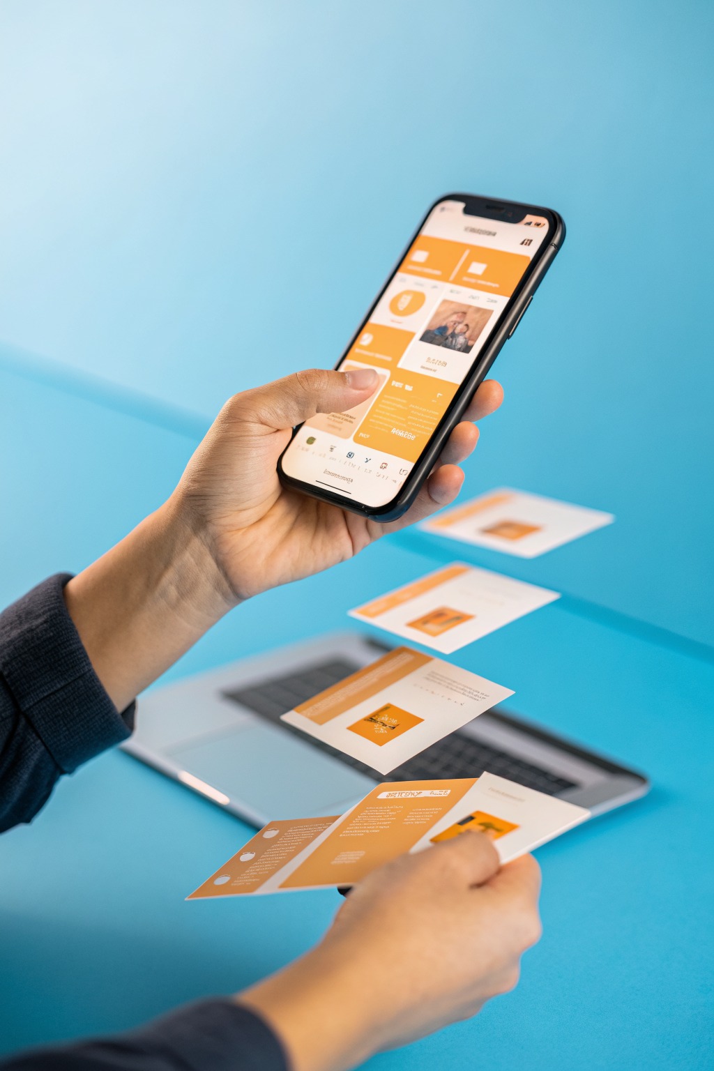
On mobile, the checkout button often sits below the fold. The customer has to scroll past order details, shipping address, payment fields, and order summary before they reach it. Every pixel of scroll is a chance to abandon.
Make the button sticky so it stays at the bottom of the screen as the customer scrolls. On most modern store platforms, this is a single toggle in the theme settings.
If your theme does not support it, a small CSS snippet does the job:
position: sticky; bottom: 0; z-index: 100;
The button should stay visible without covering the content the customer is trying to read. Add a small shadow or border so it is clearly distinct from the page content behind it.
4. Remove Every Link Near the Button
Go to your checkout page right now. Look at everything within 200 pixels of the checkout button. Is there a link to your shipping policy? A link to your returns page? A link to your contact page? A logo that links back to the homepage?
Remove every single one of them.
The checkout page is not a navigation hub. It is a runway. The only action available should be clicking the button. Every link is an exit ramp, and every exit ramp costs you sales.
Move the shipping policy information inline as text, not as a link. Put the return policy as a one-liner below the button. Remove the homepage logo link on the checkout page specifically. Most platforms let you hide it just on checkout.
5. Change the Button Colour to Contrast With Everything Else
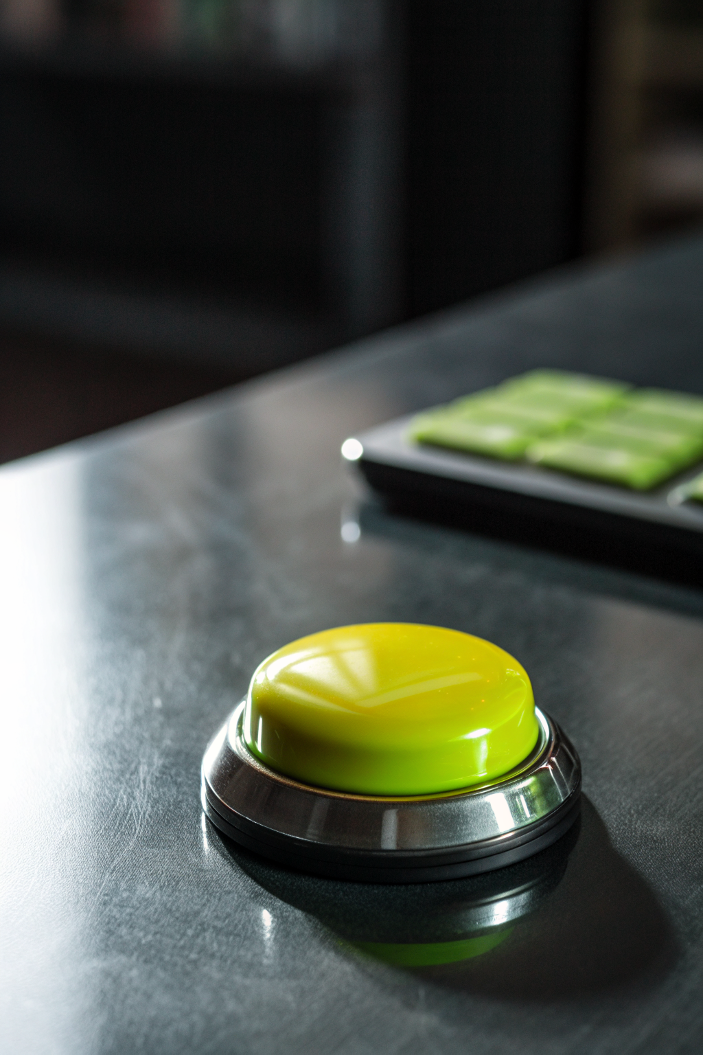
If your checkout button is the same colour as your add-to-cart button, your brand colour, or your header, it blends in. It should not blend in. It should be the most visually distinct element on the page.
The rule is simple: the checkout button colour should not appear anywhere else on the checkout page. If your page is mostly blues and greys, the button should be orange or green. If your page is warm tones, the button should be a cool contrasting colour.
This is not about brand consistency. This is about conversion. The button needs to be impossible to miss.
One caveat: do not use red. Red signals danger and cancellation. Pick a colour that is high-contrast but positive.
Quick Checklist
- Button text says what happens next, not just Place Order
- One line of reassurance directly below the button
- Button is sticky on mobile so it stays visible while scrolling
- No links within 200 pixels of the button
- Button colour contrasts with everything else on the page
Each of these takes under 10 minutes. Together, they remove the friction that quietly kills conversions at the last second.
Want more like this? Join MOKU Club for free. Weekly resources, early access to new guides, and occasional templates you can actually use. Join below.