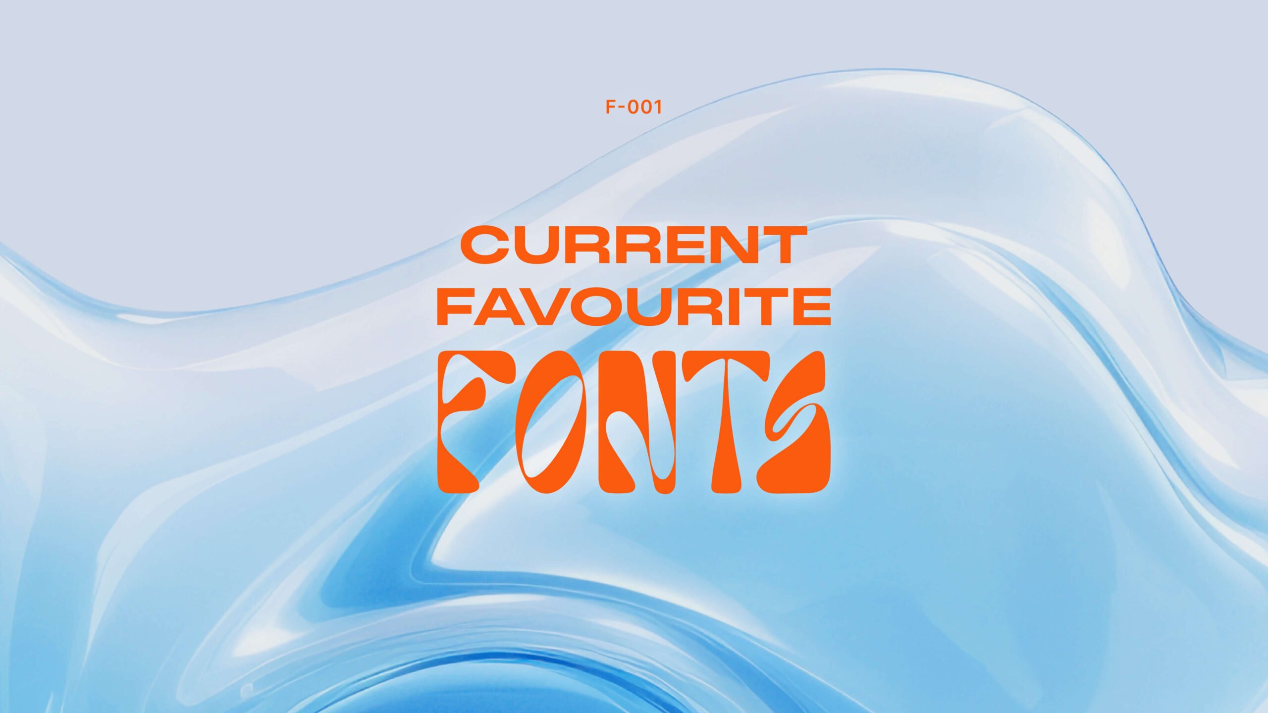
Typography is a design language in itself, and choosing the right font can sometimes be the defining factor in a design’s success. Fonts can evoke various emotions and personalities, adding depth and character to any project. Here are five of our current favourite fonts that rock the typographic canvas:
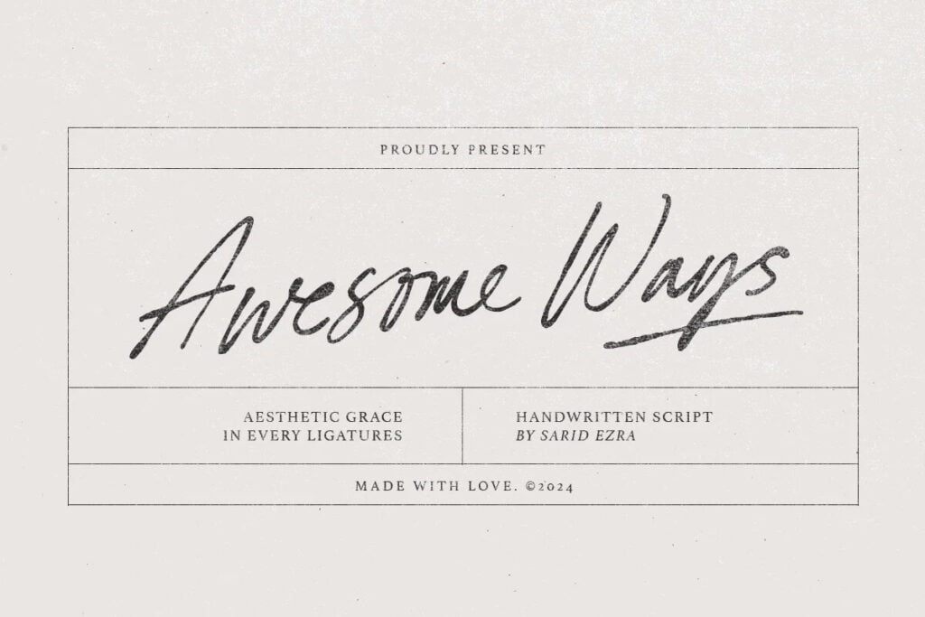
Awesome Ways by Sarid Ezra
Usage: Labels, Logos, Invitations, Handwritten Quotes
Details: Awesome Ways is a spirited handwritten script with a plethora of ligatures. It intertwines beautifully to add a natural, handcrafted feel to any project. The font is versatile, lending itself to a plethora of uses, from branding and packaging to wedding stationery. The inclusion of multi-language support ensures it’s ready for a global stage.
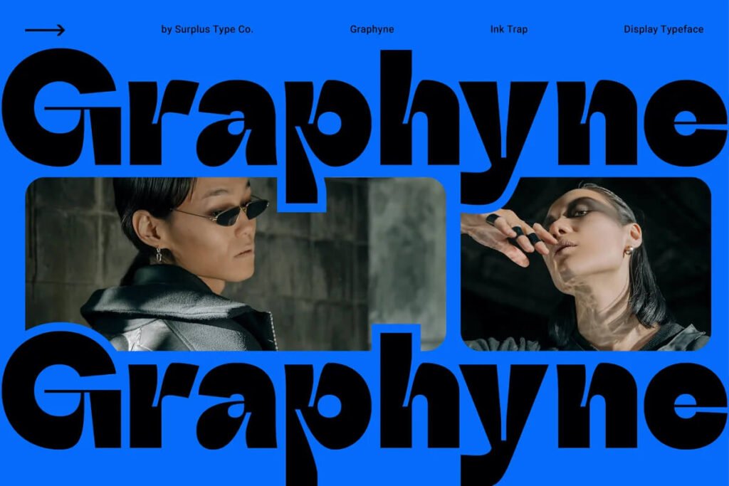
Graphyne by Surplus Type Co
Usage: Display, Branding, Editorial
Details: Graphyne is a heavyweight in the world of sans-serif display fonts. It combines the chunky appeal of a bold typeface with intricate thin components, making it perfect for large-scale applications. The contrast in its design makes it a standout for branding and headlines, especially when you want to make a big statement with a contemporary, high-contrast look.
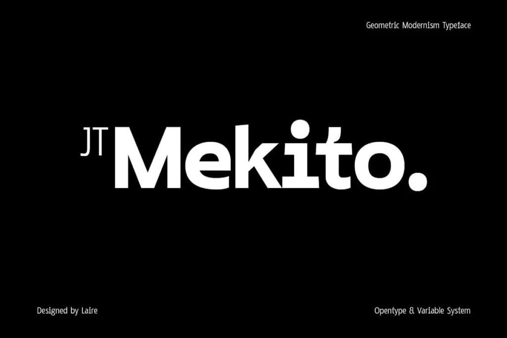
JT Mekito by Jolicia Type
Usage: Varied, from Small to Large Sizes
Details: JT Mekito is a geometric sans-serif that’s a testament to modernism. Its design, inspired by Gothic and geometric styles, ensures legibility at various sizes. With a total of 63 weights across different letterforms, this font gives you the flexibility to use it in a wide range of design applications. Whether you need something thin for a delicate touch or black for a bold statement, JT Mekito has you covered.
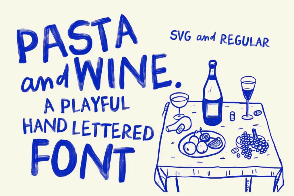
Pasta and Wine by Nicky Laatz
Usage: Playful Posters, Greeting Cards, Branding
Details: Pasta and Wine takes a casual, fun approach with its Bitmap SVG design. It truly feels hand-painted, lending a unique, joyful vibe to any project. This font is the life of the party—ideal for bold, cheeky posters, attention-grabbing greeting cards, and branding that seeks to stand out with its unique texture and colour variations.
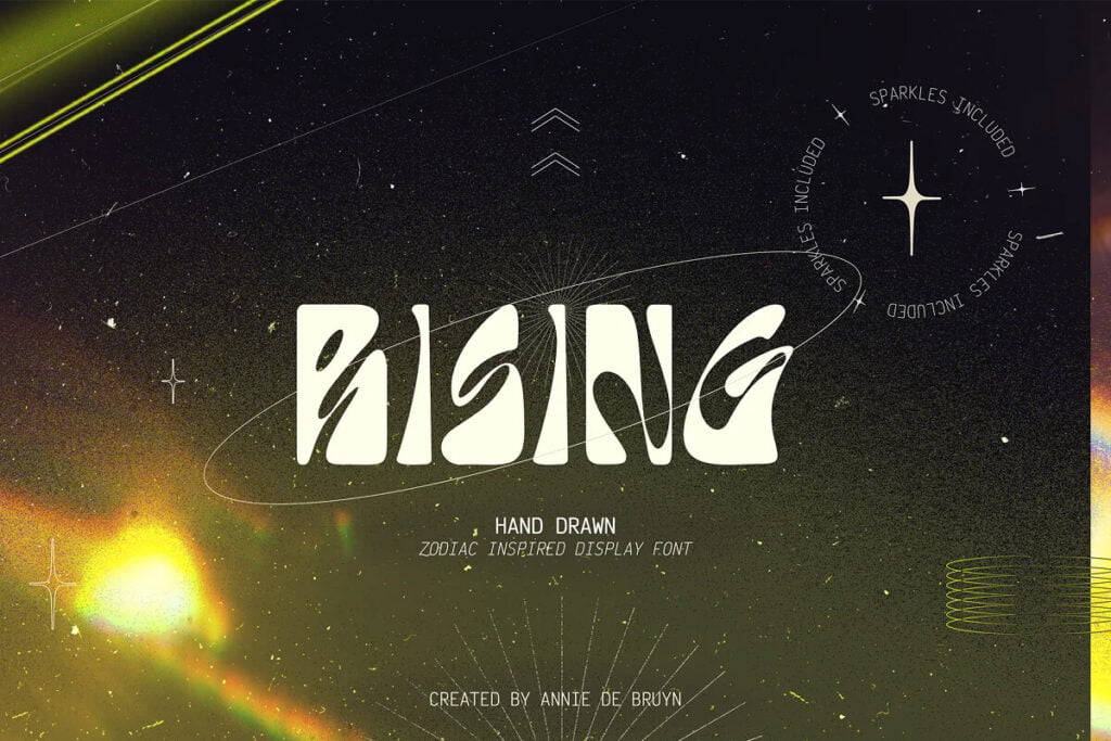
RISING by Annie De Bruyn
Usage: Astrological Themes, Display
Details: RISING is a hand-drawn delight that brings a starry flair to any project. Designed with a zodiac-inspired style, it’s a perfect fit for anything astral. The font doesn’t just deliver in its appearance; it also includes variations and sparkles—making it a go-to choice for that next celestial theme you have in mind.
Each of these fonts tells a unique story and offers an endless array of possibilities. So, whether you’re a graphic designer crafting the brand identity for a new business or a content creator looking to liven up your social media posts, be sure to keep these fonts on your radar. They might just be the missing piece in the typographic puzzle of your next great design.
