As part of the Lunar New Year, we posted a dragon illustration to mark the occasion, and we thought it would be a good idea to share our process. It’s often overlooked how much effort can go into a social media post, especially those that are more on the creative side. So here’s a little walkthrough and thought process behind the design.
1. Gathering Inspiration
To kick off our design process, we gathered a few inspirations that caught our eye and identified key elements or features we liked about it.
Illustrations that are hand-drawn or have a human element to them are currently trending. We liked the playful rough drawings, lines, and the clear simple layout.
We liked the colour palette, line texture, and overall vibrancy of the illustration.
We were inspired by character design and distinctive features. It looks fun, playful, and not overly cartoonish.
The shape and position of the dragon was what drew us to this one.
2. Planning Content & Layout
After inspiration was planning. We created a quick sketch to outline the post’s potential layout, which we used as a starting point, allowing us to envision the design.
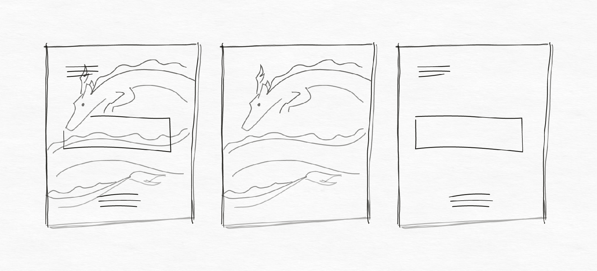
It’s important to note that we allowed ourselves to be flexible after this step. Flexibility during the design phase is crucial as ideas evolve and transform, and sometimes things just don’t turn out the way you want them to, so always leave room for play and changes.
3. Illustrating the Dragon
Staying true to our vision of a playful, minimal design, we transformed our sketch into a dragon illustration.
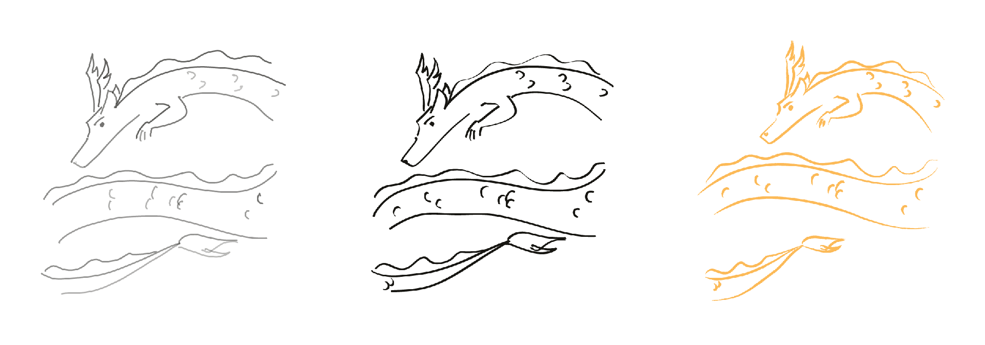
The emphasis here was to create cleaner lines but to also not be a perfectionist about it. We did increase and decrease the scale for parts of the dragon to add emphasis and dimension. The focus at this stage was to maintain a balance between simplicity and visual appeal.
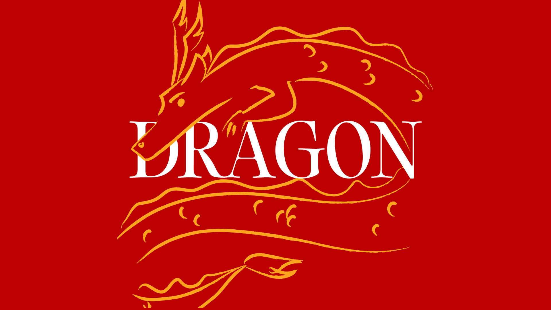
4. Designing the Post
Finally, it’s time to put everything together.
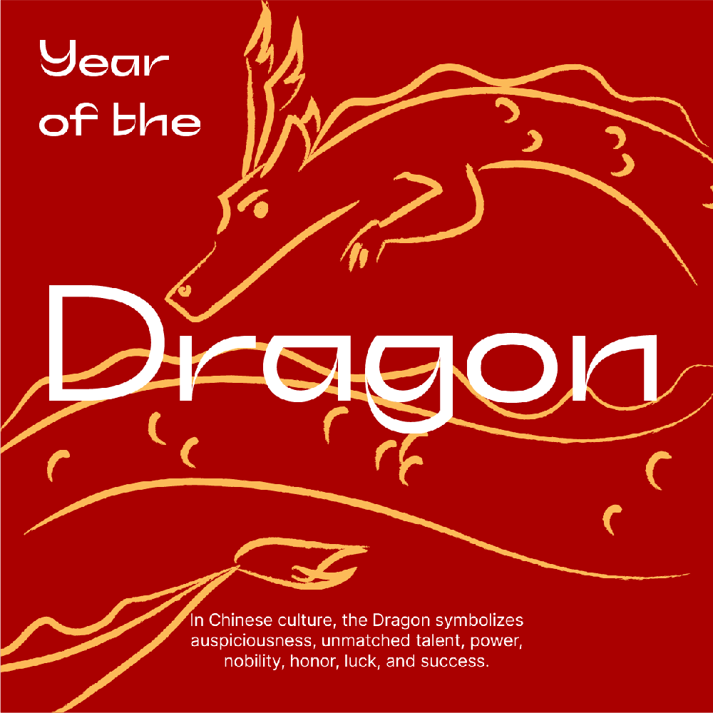
First Draft
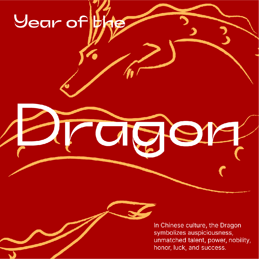
Second Draft
During the design phase, a few challenges emerged. The initial text placement was no longer ideal due to legibility, and the initially chosen typeface didn’t complement the illustration effectively.
So in response, this is what we did:
- We increased the scale of the dragon’s top half and intertwined it with the “Dragon” text, which we also increased in size for a clearer hierarchy, to add dimension
- We adjusted text placement for readability and to complement the illustration
- Text on the design was simplified to create a better balance visually
And there you have it! We hope this provided some helpful insights into one creative process, and/or inspired you a bit.
While we don’t always put in this much effort into a social media post, as creatives, we believe it’s important to do so every now and then to experiment, learn new techniques or skills and flex our creative muscles. If there’s one key takeaway from this, it’s that you should always leave room for play and experimentation, and never feel pressured to stick to one specific idea or thing.