Why Your Brand Keeps Looking Like Five Different Companies
You pick a font. Your social media person picks a different font. Your website uses a third font. Your product labels arrive and somehow they are in yet another font. Every design decision feels like starting from scratch, and the result is a brand that looks like it was assembled by committee. Which it was. An uncoordinated committee that never met.
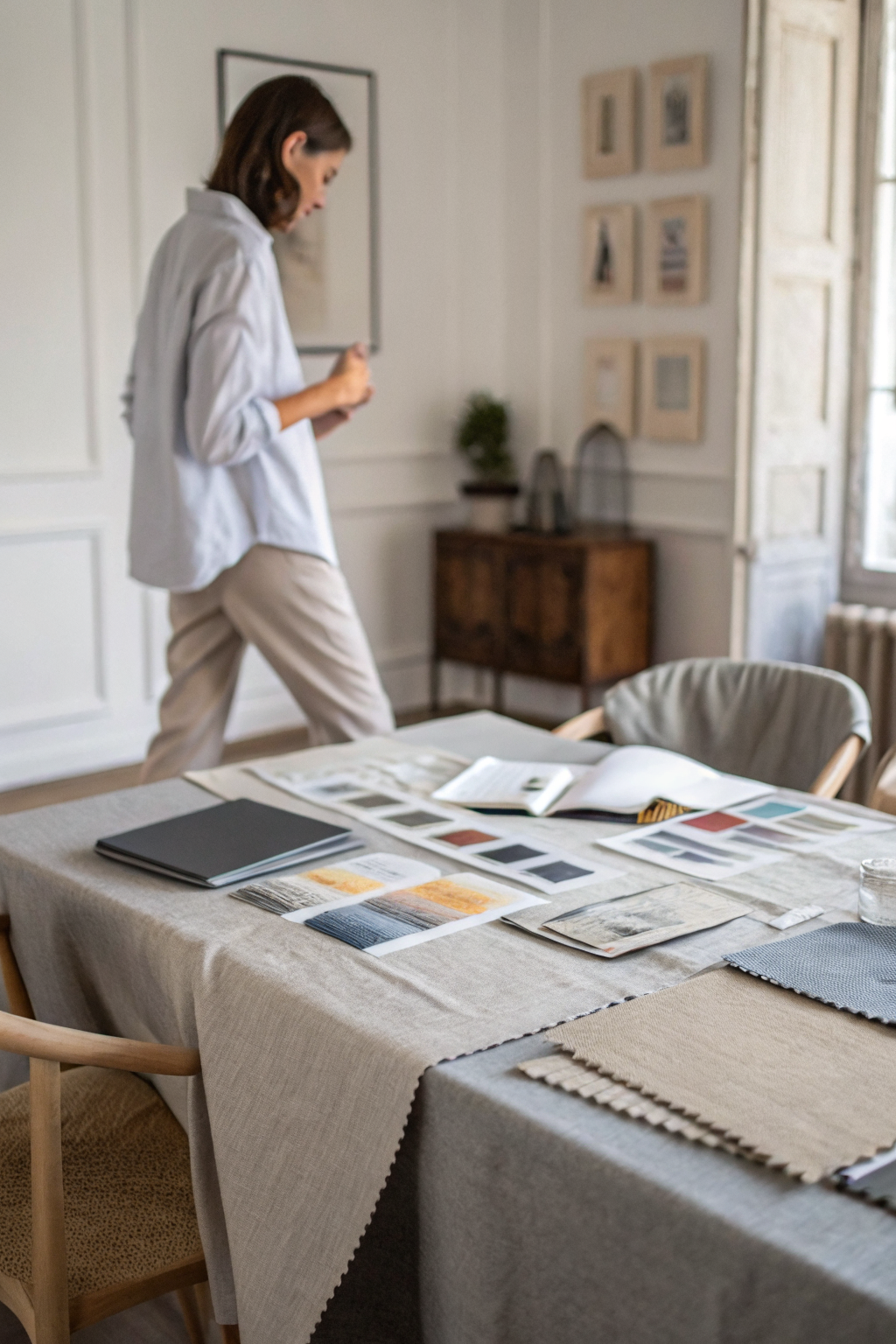
A brand mood board fixes this. Not a Pinterest board you forget about in a week. A working mood board that sits in the middle of every visual decision and makes the call when you cannot. Here is how to build one that actually works.
Step 1: Collect Before You Curate
Open a folder. Call it “raw brand stuff.” Dump everything in. Screenshots of brands you like. A photo of the colour your packaging uses. That Instagram post you saved three months ago. A texture you photographed at a market. A font you keep coming back to. Do not judge yet. Collect for at least two days. Aim for 30 to 50 pieces minimum. The more raw material, the clearer your patterns will be.
Step 2: Pull Out the Repeating Patterns
Now look at your collection. What shows up again and again? Is it warm earth tones? High-contrast black and white? Soft serif fonts? Angular sans-serifs? Photography with real people or flat-lay product shots? Write down every pattern you see. These are not coincidences. These are your brand instincts telling you what feels right. Your mood board should amplify these patterns, not override them.
Step 3: Lock Down Your Core Colours
Pick 3 to 5 colours from your patterns. Not 12. Three to five. One primary, one secondary, one accent. Two optional extras for variety. Every piece of content you create should use only these colours. Write down the hex codes. Put them in a shared doc. Pin them to the top of your Slack channel. Tattoo them on your hand if you have to. Colour inconsistency is the fastest way to look amateur.
Step 4: Choose Two Fonts and Stop
One for headings. One for body text. That is it. If you need a third for a specific use case like product labels, name it explicitly in your mood board. Do not collect fonts. Do not browse font sites for fun. Pick two that feel like your brand and move on. Your mood board should show these fonts in context: a heading, a paragraph, a price tag, an Instagram story. See them working before you commit.
Step 5: Define Your Photography Style
Scroll back through your raw collection. What kind of images kept showing up? Flat lays on white? Lifestyle shots with natural light? Bold product photography on coloured backgrounds? Moody editorial portraits? Your mood board needs 5 to 8 reference images that show your photography direction. Not exact shots to copy. A style guide. When your social media manager or photographer needs direction, they reference these 5 to 8 images, not their own taste.
Step 6: Add Texture and Mood Words
Brands are not just colours and fonts. They have a feeling. Add 3 to 5 mood words to your mood board. Words like “warm,” “confident,” “unfussy,” “playful,” or “considered.” These words become the filter for every decision. If a design choice does not match at least one mood word, it does not belong. Add a texture too if it helps. A rough linen swatch. A glossy magazine page. A matte paper stock. Something physical you can point to and say “this.”
Step 7: Put It All on One Page
Your final mood board should fit on a single page or screen. One A4. One Canva canvas. One Figma frame. Not a scrolling document. One view that shows your colours, fonts, photography references, mood words, and textures all together. If it looks cohesive on one page, it will look cohesive everywhere. If it looks like a mess, go back to step 2 and tighten your patterns.
Step 8: Make It the Decision-Maker
Here is the part most people skip. Your mood board is not decoration. It is the authority. Every time someone on your team asks “does this look right?” the answer comes from the mood board. Does it match the colours? Does it use the right fonts? Does the photography style align? If yes, ship it. If no, revise it. No more debates based on personal preference. The mood board decides.
What This Actually Looks Like in Practice
A small candle brand builds a mood board with warm cream, charcoal, and terracotta. Heading font is a clean serif. Body font is a rounded sans-serif. Photography is moody close-ups of wax and flames on dark backgrounds. Mood words: warm, calm, intentional. Every Instagram post, every label, every email header now gets measured against this board. If a team member suggests a bright pink summer promotion, the mood board says no. If they suggest a soft terracotta summer promotion, the mood board says yes.
The result is not restriction. It is speed. Decisions take minutes instead of days. Your brand looks like one company instead of five.
Want more like this? Join MOKU Club for free. Weekly resources, early access to new guides, and occasional templates you can actually use. Join below.