Bento design is not just a passing fad in the world of digital design. It’s becoming a timeless approach that not only looks great but also offers functional benefits.
What is Bento Design?
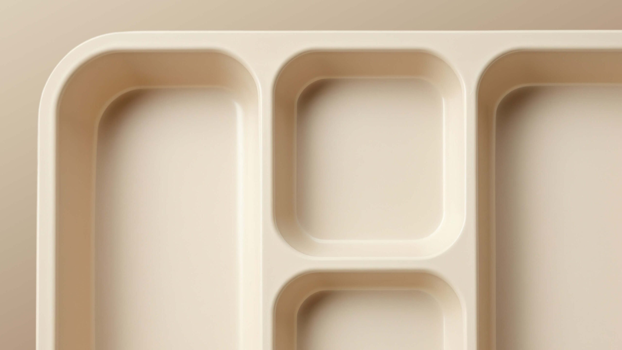
The concept involves dividing content and features into visual clusters, much like how a bento box separates food items. This approach fosters engaging digital experiences that are easy to digest for users across various contexts.
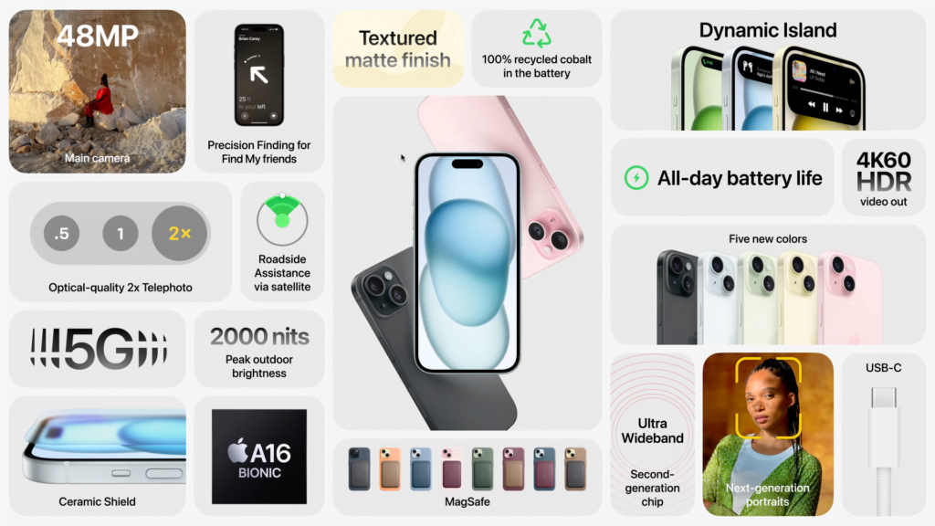
In 2023, the bento design was everywhere, and for good reason. It catered to our compartmentalised way of processing information, and made the user experience not just navigable, but immersive. Even big names in tech, such as Apple, used bento strategies to showcase their product features. We’re even seeing design journalists use it to present weekly summaries of design news on platforms such as X.

Bento design used for iPhone 15 features – from Apple’s September 12, 2023 Keynote
Here's what's happening today in design: pic.twitter.com/bmhTBQ7qhM
— Cole (@colderoshay) February 19, 2024
Here to Stay?
However, as with any popular design trend, there is a risk of visual fatigue setting in. To stay relevant, We’re seeing designers innovating and finding new ways to surprise users while still adhering to the fundamental principles of bento design. Think more animation, and more thinking outside of the box, literally.
Looking ahead, we can expect to see bento design evolve even further, becoming more fluid and less gridlocked. But one thing is for sure, in the fine art of digital presentation, the Bento remains masterful—as relevant in 2024 as it did the year before.


